The front-end framework OWL (Odoo Web Library) is used to create a modern user experience that is dynamic and reactive.
Odoo uses the QWeb type of earlier frameworks for front-end design and development, but with each new version release, OWL is fully replacing it, especially when it comes to creating UI components that operate simply with the back-end.
Talking about these OWL components, the Notification service is a component of Odoo’s OWl framework that allows developers to deliver notification messages to users in the same way.
We may create personalized, user-friendly feedback for users through the OWL notification service, including cautions, error messages, general information, success messages, and more.
Steps to Set Up OWL Notification Service In Odoo 18
The implementation of OWL notifications in Odoo 18 will be covered in this blog. The first step is to show how to implement XML code that will cause any of the Odoo 18’s UI components to activate the JavaScript method that will display the relevant notifications to the user.
To make the notification services process properly, we must first create the XML template that defines the action to take when the notice appears. Let’s look at an example code that uses a basic ‘bell’ icon as a header icon on the Odoo back-end UI.
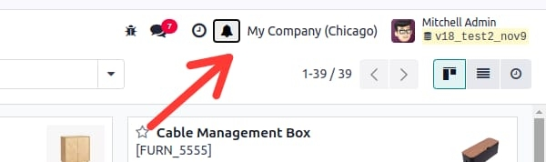
We are aware that the Odoo notification bar header icon is a quick-access function. The header icon makes it simple for users to engage with the important components of the Odoo system without having to navigate to other Odoo modules via the main interface and menus.
<?xml version="1.0" encoding="UTF-8" ?>
<templates xml:space="preserve">
<t t-name="header_icon" owl="1">
<t t-set-slot="default">
<button>
<div t-on-click="_notify">
<i id='notify_msg'
class="fa fa-bell fa-1.5x"
role="img"/>
</div>
</button>
</t>
</t>
</templates>
In this case, the icon’s t-on-click property is set to ‘_notify’ when the bell icon is clicked.
This shows the _notify() function that was created in the JavaScript component. The user can engage with the alerts by clicking on this bell symbol.
This is how the header section icon will appear.
The Javascript component for the t-on-click action needs to be integrated now. The setup() and _notify() methods are defined inside the headerIcon class, which was extended from the OWL Component, for this purpose. Here, we’re using the following JavaScript code:
/* @odoo-module */
import { registry } from "@web/core/registry";
import { useService } from "@web/core/utils/hooks";
import { Component } from "@odoo/owl";
import { _t } from "@web/core/l10n/translation";
class NotificationIcon extends Component {
setup() {
this.notificationService = useService("notification");
}
_notify() {
{
this.notificationService.add(_t("Success message test."), {
title: "Success",
type: "success"
});
}
}
}
NotificationIcon.template = "header_icon";
export const systrayItem = { Component: NotificationIcon,};
registry.category("systray").add("HeaderIcon", systrayItem, { sequence: 1 });
The very first step is to add the line /** @odoo-module **/ and to import the registry, useService, Owl component, and _t for translation of the string.
The headerIcon class is built by extending the Component class, which is imported from the OWL library.
We use the setup() function to add the notification service, and the notification's text is defined inside the _notify() method as
_notify() {
this.notificationService.add(
_t("Major error occurred. Please contact
support or change the settings from the
below button."),
{
title: "Error",
type: "danger",
buttons: [{
onClick: () => { },
primary: true,
name: "Go to Settings",
},],
});
}
For a notification service to get defined, the keywords used for it are
add: To display the notification content with the required message enclosed in quotes, use the dot(.) operator and the command "add." The characteristics that can be utilized inside the material are
- title: The message, or the content of the string to show.
- type: This defines the type of the message. It can be “success”, “info”, “warning” or “danger”.
- button: To add a custom button with attributes like name, onClick(), primary, etc.
- sticky: It can have either “True” or “False” which defines whether or not the message should stick into the view until the user closes it manually.
- e. duration: This specifies how long (time duration in milliseconds) the message should remain on the screen.
remove: Just opposite to the ‘add’, this is used to remove a specific notification.
clear: Clears the notification.
When we click the bell icon in the header, we receive the notification with the above js code as
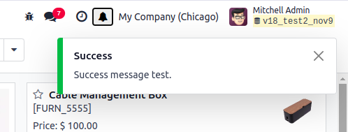
We can now just analyze the sample programs to display a different kind of notification. The _notify() function can be rewritten as
_notify() {
{
this.notificationService.add(_t("Success message test."), {
title: "Success",
type: "success"
});
}
}
After the design of the needed notifications, the .xml and .js files are added to the manifest file of the module under 'assets': {'web.assets_backend':[],} key. Here in our case, since our module name is ‘notification_icon’, the manifest file’s assets key is defined as
'assets': {
'web.assets_backend': [
'notification_icon/static/src/**/*',
'notification_icon/static/src/**/*',
],
},
This feature is especially handy for conveying a variety of messages, including:
- Alerts : Immediate alerts regarding security flaws, system faults, or urgent updates that need the user’s attention.
- Warnings : Warning messages warn users about prospective problems or activities that may have unexpected results.
- Information : Notifying users about system status, upcoming events, or workflow changes through general updates, reminders, or confirmation messages.
Customization Options
The OWL Notification Service is extremely customizable, allowing developers to personalize notifications to their companies specific requirements. Customization possibilities include:
- Appearance : Notifications can have icons or other visual components to improve clarity, and they can be color-coded to reflect their type such as red for errors, yellow for warnings, and green for success messages.
- Duration : The duration of notifications displayed on the screen can be customized by developers.
- Behavior : Notifications can function as custom buttons with event handlers that perform actions when pressed.
Integration with Odoo Modules
To ensure relevant information is shared across multiple modules including sales, inventory, accounting, and human resources, the notification system can be linked with a number of Odoo modules.
Hence, this integration provides smooth operations and improves decision-making by maintaining a consistent and knowledgeable user base.
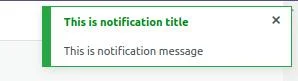
It has a very simple syntax to understand:
this.notificationService.add(_t("Success message test."), {
title: "Success",
type: "success"
});
Message Displayed in the Notification Box:
The actual message you wish to show the user will appear on the first line of the notification configuration. This message, which should be short but informative, is the notification’s primary content. It might be an alarm, a reminder, or a piece of information that the user needs to view, for example.
Example : "This is a notification message"
Title of the Notification:
The title is a brief heading that appears at the top of each notice. It gives a brief description of what the notice is about. The Title should be specific to the point, allowing the user to understand the notification purpose right away.
Example: "Upload Complete"
Type of Notification:
The color and the related icon are defined by the type of notification. Various types of notifications are used to communicate various categories. Common types of notifications include:
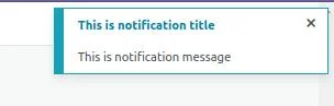
- success - Usually green, showing the successful completion of the process.
this.notificationService.add(_t("This is notification message"), {
title: "This is notification title",
type: "success"
});
- Info - Usually blue, showing the general information that is not important.
this.notificationService.add(_t("This is notification message"), {
title: "This is notification title",
type: "info"
});
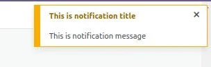
- Warning - Usually yellow or orange, mentioning a potential issue that the user should be aware of.
this.notificationService.add(_t("This is notification message"), {
title: "This is notification title",
type: "warning"
});
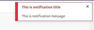
- Danger - Usually red, indicating that something went wrong.
this.notificationService.add(_t("This is notification message"), {
title: "This is notification title",
type: "danger"
});
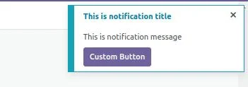
And we have other options
- Stays on the screen until the user dismisses it by clicking the cross button.

- Custom buttons can be inserted in the notice, with custom click event handlers that do specific actions when clicked.
this.notificationService.add(_t("This is notification message"), {
title: "This is notification title",
type: "info",
buttons: [{
onClick: () => {},
primary: true,
name: "Custom Button",
},],
});
In conclusion, we can state that the OWL Notification services can be integrated into JavaScript and implemented using XML, allowing for the efficient delivery of a variety of customized and user-friendly messages to users.
The use cases can be defined as the necessity to manage errors, submit forms successfully, and respond to various systems events based on the process we build. This opens the door to Odoo 18's enhanced user experience with prompt feedback.